Drawing Custom Alerts on Top of Bottom Sheets in Jetpack Compose
I break (and occasionally build) apps for Android. I sometimes work on backend as well. When I'm not coding, I can most likely be found watching a TV Show, a movie, playing video games or reading a book.
Bottom Sheets have become ubiquitous in Mobile design across Android and iOS. If you’re using Jetpack Compose, you’ll likely implement them using either the ModalBottomSheet or the BottomSheetScaffold. The former is more used in my experience, so further references to the bottom sheets in this article will mean ModalBottomSheet. We’ll be using the Material 3 implementation for the component.
Assume a scenario where we want to display a bottom sheet, and upon some action, show a custom alert message at the top of the screen. This alert should appear on top of the sheet, but it’s not as trivial as it may seem. Let’s start with the custom alert.
Custom Alert
I find the default Snackbar available in Material 3 to be quite restrictive. This is why we’ll design our own, using a Popup composable. It’s part of the Compose UI package and is available with or without Material implementation. From the docs,
A popup is a floating container that appears on top of the current activity It is especially useful for non-modal UI surfaces that remain hidden until they are needed, for example floating menus like Cut/Copy/Paste.
This seems suitable for our use case. Let’s make a custom alert that appears on the top, displays some text, and disappears after 2 seconds. We can use the following code for this purpose.
@OptIn(ExperimentalComposeUiApi::class)
@Composable
private fun Content() {
    var showAlert by remember { mutableStateOf("") }

    Box(
        modifier = Modifier
            .fillMaxSize()
            .background(Color(0x55242424))
    ) {
        Button(
            onClick = { showAlert = "Hello, world!" },
            modifier = Modifier.align(Alignment.Center)
        ) {
            Text("Click me!")
        }
    }

    Popup(
        alignment = Alignment.TopCenter,
        properties = PopupProperties(
            dismissOnClickOutside = false,
            dismissOnBackPress = false,
            usePlatformDefaultWidth = false
        )
    ) {
        AnimatedVisibility(
            modifier = Modifier.fillMaxWidth(),
            visible = showAlert.isNotBlank(),
            enter = expandVertically(),
            exit = shrinkVertically()
        ) {
            LaunchedEffect(Unit) {
                delay(2000)
                showAlert = ""
            }

            Alert(message = showAlert)
        }
    }
}

@Composable
private fun Alert(message: String) {
    Text(
        text = message,
        modifier = Modifier
            .fillMaxWidth()
            .padding(horizontal = 32.dp)
            .shadow(5.dp)
            .background(Color.White)
            .padding(vertical = 16.dp),
        textAlign = TextAlign.Center
    )
}
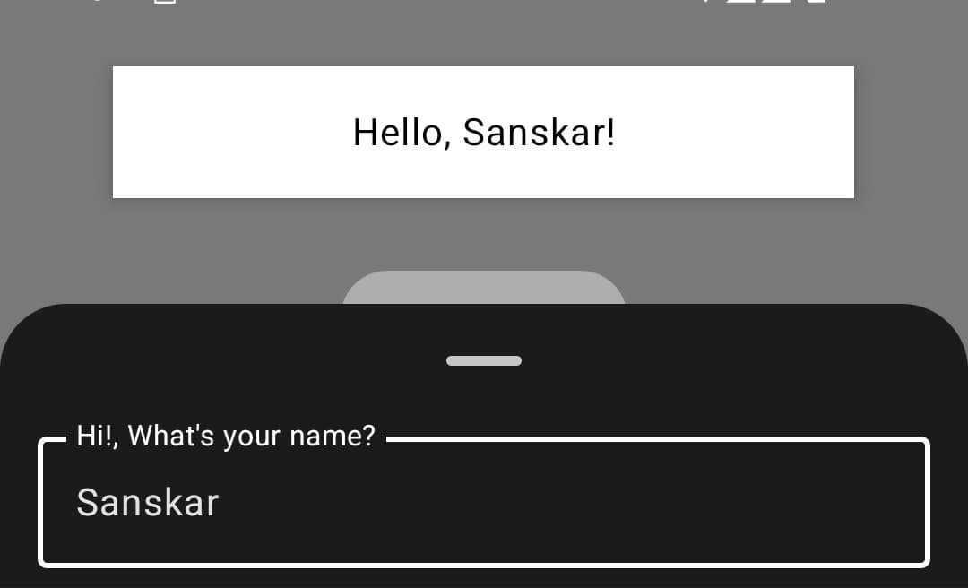
This results in the following UI being drawn:

Good enough. Now, we can move on to the Bottom Sheet.
The Bottom Sheet
Let’s create a bottom sheet that asks a user for their name and shows them a welcome alert.
@OptIn(ExperimentalComposeUiApi::class)
@Composable
private fun Content() {
    var showSheet by remember { mutableStateOf(false) }

    if (showSheet) {
        NameSheet(
            onDismiss = { showSheet = false },
            onNameInput = { name ->
                // TODO show alert
            }
        )
    }

    Box(
        modifier = Modifier
            .fillMaxSize()
            .background(Color(0x55242424))
    ) {
        Button(
            onClick = { showSheet = true },
            modifier = Modifier.align(Alignment.Center)
        ) {
            Text("Show Sheet")
        }
    }
}

@OptIn(ExperimentalMaterial3Api::class)
@Composable
private fun NameSheet(
    onDismiss: () -> Unit,
    onNameInput: (String) -> Unit
) {
    ModalBottomSheet(
        onDismissRequest = onDismiss
    ) {
        var name by remember { mutableStateOf("") }
        OutlinedTextField(
            value = name,
            onValueChange = { name = it },
            label = { Text("Hi!, What's your name?") },
            placeholder = { Text("John Doe") },
            modifier = Modifier
                .fillMaxWidth()
                .padding(horizontal = 16.dp)
                .padding(bottom = 8.dp),
            keyboardOptions = KeyboardOptions(
                keyboardType = KeyboardType.Text,
                imeAction = ImeAction.Done
            ),
            keyboardActions = KeyboardActions(
                onDone = { onNameInput(name) }
            ),
            singleLine = true
        )
    }
}
Upon rendering, we find that the UI can be a bit better. The scrims don’t draw correctly on the system bar, and the navigation bar insets are not being consumed by the sheet. This is not ideal since apps on Android 15 draw content edge-to-edge.

This is a bug in the earlier versions of Material3. A fix was published in May with the release of Version 1.3.0-alpha06 of Material 3 for Compose. Since 1.3.0 stable is available now, we will use that:
implementation("androidx.compose.material3:material3:1.3.0")
Just switching the library version fixes the issue, and we get this now:

Now, we just need to show the alert when the user inputs their name and hits the done IME action.
Displaying the Alert with Bottom Sheet open
Let’s now use the following code to display an alert when a user inputs their name and hits the done button on the keyboard.
@Composable
private fun Content() {
    var showAlert by remember { mutableStateOf("") }
    var showSheet by remember { mutableStateOf(false) }

    if (showSheet) {
        NameSheet(
            onDismiss = { showSheet = false },
            onNameInput = { name ->
                showAlert = "Hello, $name!"
            }
        )
    }

    Box(
        modifier = Modifier
            .fillMaxSize()
            .background(Color(0x55242424))
    ) {
        Button(
            onClick = { showSheet = true },
            modifier = Modifier.align(Alignment.Center)
        ) {
            Text("Show Sheet")
        }
    }

    Popup(
        alignment = Alignment.TopCenter,
        properties = PopupProperties(
            dismissOnClickOutside = false,
            dismissOnBackPress = false,
            usePlatformDefaultWidth = false
        )
    ) {
        AnimatedVisibility(
            modifier = Modifier.fillMaxWidth(),
            visible = showAlert.isNotBlank(),
            enter = expandVertically(),
            exit = shrinkVertically()
        ) {
            LaunchedEffect(Unit) {
                delay(2000)
                showAlert = ""
            }

            Alert(message = showAlert)
        }
    }
}

@Composable
private fun Alert(message: String) {
    Text(
        text = message,
        modifier = Modifier
            .fillMaxWidth()
            .padding(horizontal = 32.dp)
            .shadow(5.dp)
            .background(Color.White)
            .padding(vertical = 16.dp),
        textAlign = TextAlign.Center
    )
}

@OptIn(ExperimentalMaterial3Api::class)
@Composable
private fun NameSheet(
    onDismiss: () -> Unit,
    onNameInput: (String) -> Unit
) {
    ModalBottomSheet(
        onDismissRequest = onDismiss
    ) {
        var name by remember { mutableStateOf("") }
        OutlinedTextField(
            value = name,
            onValueChange = { name = it },
            label = { Text("Hi!, What's your name?") },
            placeholder = { Text("John Doe") },
            modifier = Modifier
                .fillMaxWidth()
                .padding(horizontal = 16.dp)
                .padding(bottom = 8.dp),
            keyboardOptions = KeyboardOptions(
                keyboardType = KeyboardType.Text,
                imeAction = ImeAction.Done
            ),
            keyboardActions = KeyboardActions(
                onDone = { onNameInput(name) }
            ),
            singleLine = true
        )
    }
}
Let’s see the output:

We notice that the popup is rendered behind the Bottom Sheet’s scrim. This happens because the current implementation of the Bottom Sheet uses Dialog as the base component, which has a higher z-index. We can see the commit here:

This is not the best UX, and we ideally want to draw the alert on top of the Bottom Sheet. Two solutions come to mind:
Potential Solution: Popup inside BottomSheet content
If we draw the Popup inside the Bottom Sheet’s content, it’ll be inside the Dialog in which the Bottom Sheet is displayed and will render on top of it. Let’s modify our code:
@Composable
private fun Content() {
    var showSheet by remember { mutableStateOf(false) }

    if (showSheet) {
        NameSheet(onDismiss = { showSheet = false },)
    }

    Box(
        modifier = Modifier
            .fillMaxSize()
            .background(Color(0x55242424))
    ) {
        Button(
            onClick = { showSheet = true },
            modifier = Modifier.align(Alignment.Center)
        ) {
            Text("Show Sheet")
        }
    }
}

@Composable
private fun Alert(message: String) {
    Text(
        text = message,
        modifier = Modifier
            .fillMaxWidth()
            .padding(horizontal = 32.dp)
            .shadow(5.dp)
            .background(Color.White)
            .padding(vertical = 16.dp),
        textAlign = TextAlign.Center
    )
}

@OptIn(ExperimentalMaterial3Api::class)
@Composable
private fun NameSheet(
    onDismiss: () -> Unit,
) {
    var showAlert by remember { mutableStateOf("") }

    ModalBottomSheet(
        onDismissRequest = onDismiss
    ) {
        var name by remember { mutableStateOf("") }
        OutlinedTextField(
            value = name,
            onValueChange = { name = it },
            label = { Text("Hi!, What's your name?") },
            placeholder = { Text("John Doe") },
            modifier = Modifier
                .fillMaxWidth()
                .padding(horizontal = 16.dp)
                .padding(bottom = 8.dp),
            keyboardOptions = KeyboardOptions(
                keyboardType = KeyboardType.Text,
                imeAction = ImeAction.Done
            ),
            keyboardActions = KeyboardActions(
                onDone = { showAlert = "Hello, $name!" }
            ),
            singleLine = true
        )

        Popup(
            alignment = Alignment.TopCenter,
            properties = PopupProperties(
                dismissOnClickOutside = false,
                dismissOnBackPress = false,
                usePlatformDefaultWidth = false
            )
        ) {
            AnimatedVisibility(
                modifier = Modifier.fillMaxWidth(),
                visible = showAlert.isNotBlank(),
                enter = expandVertically(),
                exit = shrinkVertically()
            ) {
                LaunchedEffect(Unit) {
                    delay(2000)
                    showAlert = ""
                }

                Alert(message = showAlert)
            }
        }
    }
}
This doesn’t quite work as intended, because now the Popup has the same container size as the Bottom Sheet, and does not render at the top of the screen (unless the Bottom Sheet is at full height):

Actual Solution: Using dialog to display the alert
This is a workaround I came up with recently: Instead of using a Popup to display the alert, we’ll switch to a Dialog to render it on top of the sheet. This is a bit more complicated since
Dialogs intercept any clicks on views beneath them, so as long as the alert is visible, the user will not be able to interact with the UI. To solve this issue, we set some
WindowManagerflags to make the dialog not focusable, resulting in it allowing click passthrough.The dialog cannot be a persistent part of the UI like the
Popup. It must be added to the tree after the sheet so that it obtains a higher z-index.
Let’s look at code that implements both of these scenarios:
@Composable
private fun Content() {
    var showAlert by remember { mutableStateOf("") }
    var showSheet by remember { mutableStateOf(false) }

    if (showSheet) {
        NameSheet(
            onDismiss = { showSheet = false },
            onNameInput = { name ->
                showAlert = "Hello, $name!"
            }
        )
    }

    // Screen content
    Box(
        modifier = Modifier
            .fillMaxSize()
            .background(Color(0x55242424))
    ) {
        Button(
            onClick = { showSheet = true },
            modifier = Modifier.align(Alignment.Center)
        ) {
            Text("Show Sheet")
        }
    }

    if (showAlert.isNotBlank()) {
        Alert(showAlert) { showAlert = "" }
    }
}

@Composable
private fun Alert(
    message: String,
    onDismiss: () -> Unit
) {
    Dialog(
        onDismissRequest = onDismiss,
        properties = DialogProperties(
            dismissOnClickOutside = false,
            dismissOnBackPress = false,
            usePlatformDefaultWidth = false
        )
    ) {
        (LocalView.current.parent as DialogWindowProvider).window.apply {
            setDimAmount(0f)
            addFlags(WindowManager.LayoutParams.FLAG_NOT_TOUCHABLE)
            addFlags(WindowManager.LayoutParams.FLAG_NOT_FOCUSABLE)
        }

        AnimatedVisibility(
            modifier = Modifier
                .fillMaxSize()
                .padding(top = 8.dp)
                .padding(horizontal = 16.dp)
                .wrapContentHeight(Alignment.Top),
            visible = message.isNotBlank(),
            enter = expandVertically(),
            exit = shrinkVertically()
        ) {
            LaunchedEffect(Unit) {
                delay(2000)
                onDismiss()
            }

            Text(
                text = message,
                modifier = Modifier
                    .fillMaxWidth()
                    .padding(horizontal = 32.dp)
                    .shadow(5.dp)
                    .background(Color.White)
                    .padding(vertical = 16.dp),
                textAlign = TextAlign.Center
            )
        }
    }
}

@OptIn(ExperimentalMaterial3Api::class)
@Composable
private fun NameSheet(
    onDismiss: () -> Unit,
    onNameInput: (String) -> Unit
) {
    ModalBottomSheet(
        onDismissRequest = onDismiss
    ) {
        var name by remember { mutableStateOf("") }
        OutlinedTextField(
            value = name,
            onValueChange = { name = it },
            label = { Text("Hi!, What's your name?") },
            placeholder = { Text("John Doe") },
            modifier = Modifier
                .fillMaxWidth()
                .padding(horizontal = 16.dp)
                .padding(bottom = 8.dp),
            keyboardOptions = KeyboardOptions(
                keyboardType = KeyboardType.Text,
                imeAction = ImeAction.Done
            ),
            keyboardActions = KeyboardActions(
                onDone = { onNameInput(name) }
            ),
            singleLine = true
        )
    }
}
Since this is relatively complex, let’s walk over some bits that require further elucidation:
    if (showAlert.isNotBlank()) {
        Alert(showAlert) { showAlert = "" }
    }
Earlier, our
Popupwas a consistent part of the UI tree, but as explained above, the dialog needs to be added after the sheet for it to appear higher.(LocalView.current.parent as DialogWindowProvider).window.apply { setDimAmount(0f) addFlags(WindowManager.LayoutParams.FLAG_NOT_TOUCHABLE) addFlags(WindowManager.LayoutParams.FLAG_NOT_FOCUSABLE) }Since we need to change the window properties, we obtain an instance through the
DialogWindowProviderinterface. Then, we set the dim amount to 0, so that the Dialog doesn’t draw any shadow behind it. Additionally, we set two layout flags that make the dialog not touchable or focusable, causing it to pass clicks to views beneath it, allowing interaction with the UI as long as the alert is visible.AnimatedVisibility( modifier = Modifier .fillMaxSize() .padding(top = 8.dp) .padding(horizontal = 16.dp) .wrapContentHeight(Alignment.Top),Since there isn’t a direct and easy method to provide the position of a dialog, we instead measure the content to take up the entire screen, and then only draw in the area that is required. Essentially, we’re actually rendering the dialog over all of the screen space, but only the alert is visible since we wrap it to the height of the content, which is the Text. This can be extended to have Images, Icons, etc.
This implementation outputs the intended behavior:

Dialog to be added to the tree first, and then for the animation to happen.This largely satisfies the requirement we stated at the start of the article, and can be used as the global snackbar at the root of your app in conjunction with a CompositionLocal to provide access to the Snackbar stream. To read how you can do that, consult this post:
Thanks for reading, any feedback is welcome!